


Your popup is the Tesla that’s going at the speed of a Maruti 800. Let me show you how to drive it the right way.
A D2C brand’s popup must:
Chances are that you have scored 0/4 in this test. And that’s okay. Most of what I’m about to show you is not common knowledge at all, and is pretty gatekept.
This is Porcellia’s Popup Optimization Theory.
For Manzuri (my D2C brand), this new popup strategy has been instrumental in helping us stabilize numbers in probably our toughest year till date. It has:
But for Porcellia’s clients, it was one of the biggest revelations of 2024. Since implementing this, we have been able to:
50% of the wins are a result of some cool data collection practices which give us advanced behavioural insights into our customers:
-> How old are they?
-> how many kids do they have?
-> how many grams of protein do they consume daily?
-> What is their favorite s*x position?
The other 50%? - simply put - these are popup 101s which you are most likely already doing. And if you’re not doing that, you should be really excited because what you’ll learn here will likely increase your D2C store’s revenue by 20% minimum.
While working on this playbook/ebook, I realised a very big problem which most brands face when they try to implement these learnings. Brands do not have qualitative analytics setup.
We know superficial things about our customers through google analytics & meta ads.
But do we REALLY know them? Do we really know their deepest darkest fears and desires?

1. How many times a week do you work out?
2. How do you stay fit? (gym, running, yoga, calisthenics)
3. How do you consume your protein? (with water, with daal, with smoothie, shake etc.)
4. What is your ideal serving per scoop?
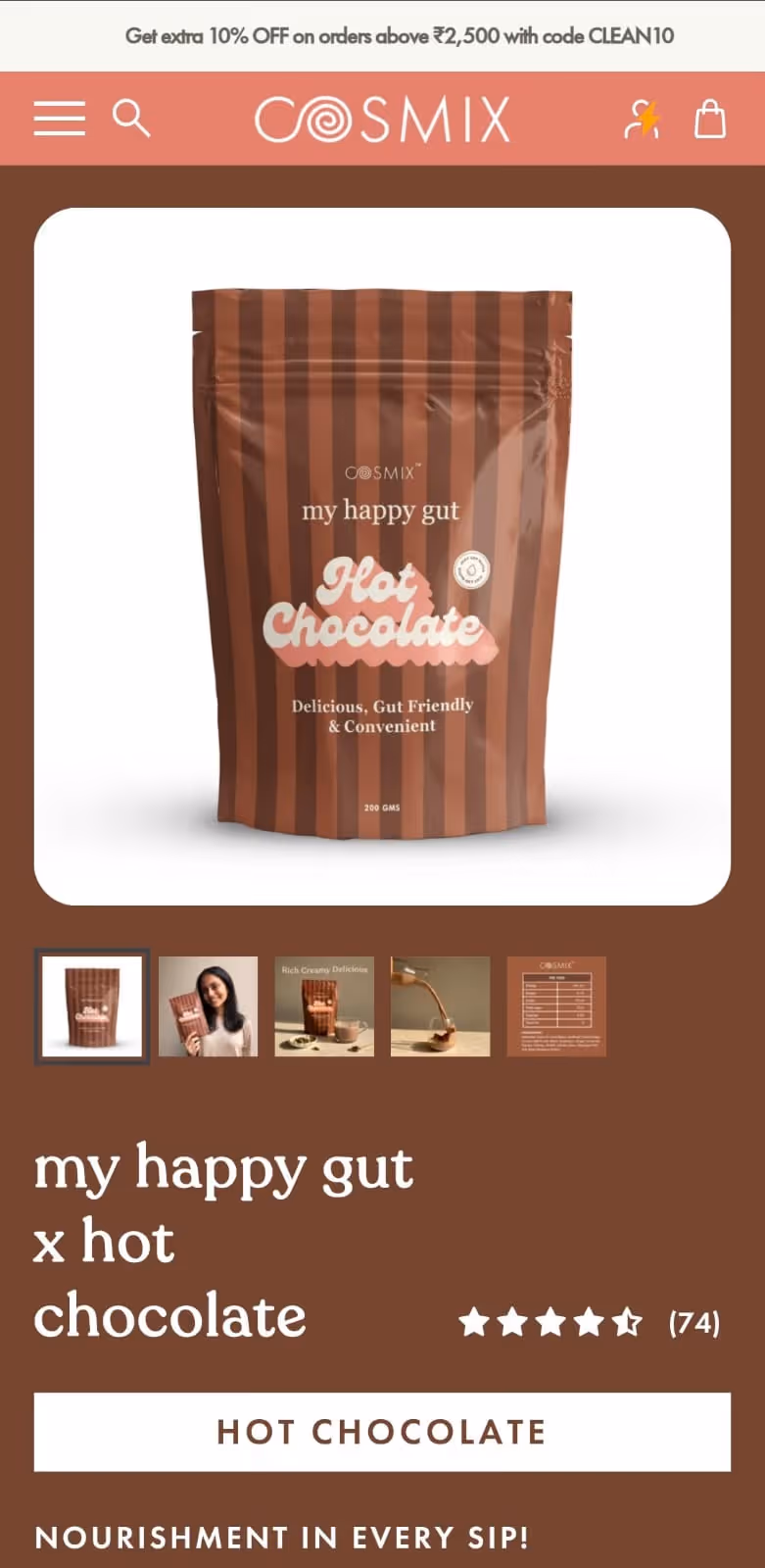
1. How many cups of hot chocolate do they drink per week?
-> 1-2, 2-4, 5+
2. Are they buying for themselves or for their family or to gift someone?
3. Do they have any kind of tummy troubles?
-> IBS, GED, None of the above

1. How old is your dog?
2. How big is your dog?
3. How many times a day do you walk your dog?
4. What is your biggest fear about your dog?
- They may run away
- They may bite someone
- Poor eyesight
- Weak joints
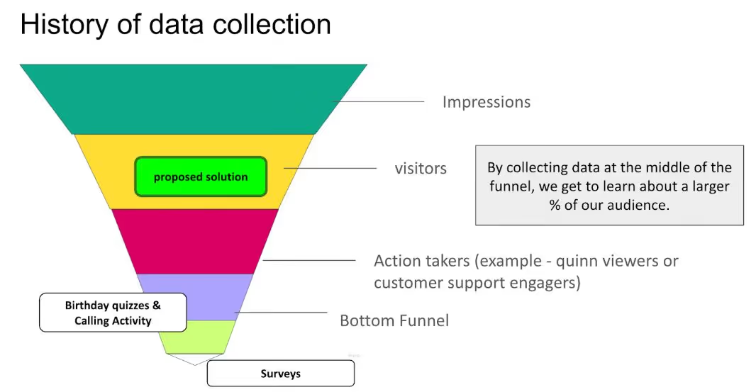
Back in the day, brands used to conduct regular 1-1 research sessions with their customers to identify market insights. Today, there is a big need to automate this process by using technology, so that these insights can be drawn at scale. And by asking users these questions before they have purchased from you, you’re getting data of customers before they even purchase from you - giving you about 20x more data points than before.
Once you’ve seen the above training, please continue to the next sub-section to learn more about how exactly to implement our POT.
In their most common form, popup signup forms are typically used in ecommerce to collect contact information from visitors of a website. In the context of ecommerce, the most common example is a popup requesting an email for a discount.
Multi-step popup forms follow the same structure as existing forms but ask follow-up questions to collect data between the subscribing step and providing the discount code step.
Questions are typically asked one at a time with individual answers, no open-ended answers.
This modern practice of collecting multiple data points from a subscriber during signup effectively drives data collection.
The additional steps are made possible by using “live data collection” on a per-step basis. Live data collection eliminates losing data if a visitor drops out during a multi-step signup flow.
This technology is game-changing and has not been widely adopted. However, changes in the world of privacy are likely to lead to an increase in the use of “live data collection forms” over the next year and beyond.
There are four widely used examples of the popups:
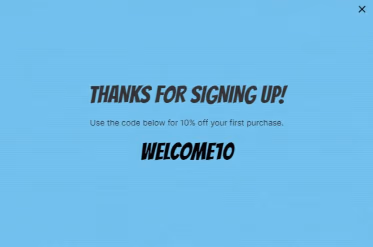
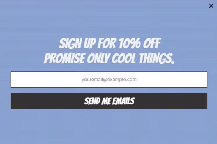
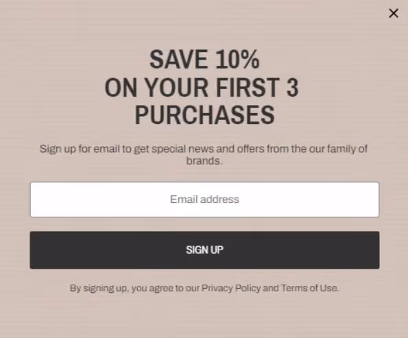
Step 1: Provide an email address

Step 2: Get a coupon code.
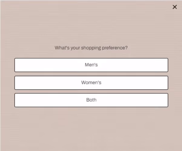
Step 1: Provide an email address + style preference

Step 2: Get a coupon code.

Starts with a question, “Would you like a discount?” then goes to the next step to provide contact details in exchange for the discount.
Step 1: Micro Opt-in

Step 2: Email Collection

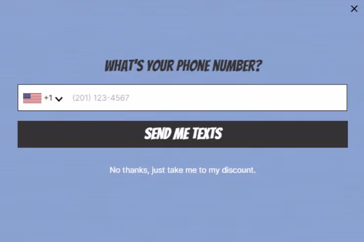
Asks for an email address on the first step and a phone number on the second step.
This one has become the most popular one in light of iOS 15 changes.
Step 1: Email Collection
Step 2: Phone number collection
The privacy shift currently underway requires a change to prioritize zero-party data collection.
Apple’s privacy announcements have spurred a need for the faster adoption of these changes.
What began with GDPR and CCPA now includes Apple as a catalyst.
The fallout has left most e-commerce brands scrambling to compare Facebook Ads data with Google Analytics data and other sources in Google Data Studio to create custom dashboards.
With the reduced browser tracking, though, even those numbers are turning into approximations.
In the pre-purchase customer journey, the signup for a discount is the main driver of intent.
It provides the most relevant information about the customer when they have decided to exchange their contact information for a discount. The customer is CHOOSING to exchange their data for a reward. They are showing INTENT of taking a forward action towards a purchase.
This is an amazing time to collect more data from your customer as long as it relates to their customer journey.
When done correctly, we see a 95% completion rate of the entire form. With a staggering 99.96% of people providing at least one data point beyond an email address. (Data taken across Formtoro Clients)

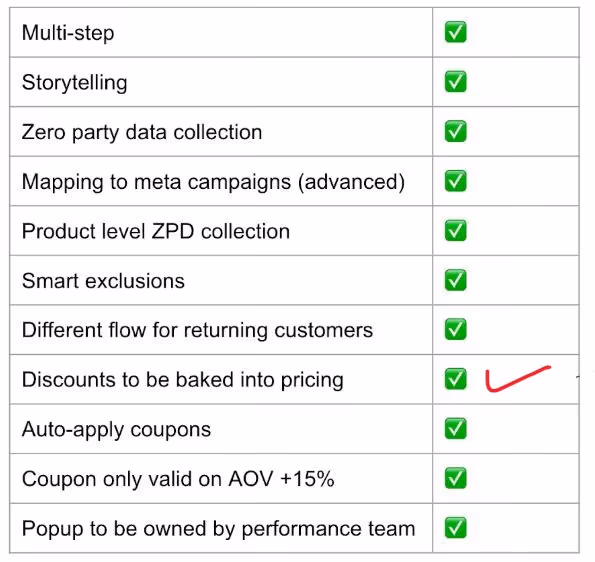
Here’s the popup strategy for you to follow as-is.
You don’t need all these to get started, but it’s what we’ve found to work for us.
We have five separate popups:
Any page other than Product, Landing, or Cart
Let people know there is an offer. On average, visitors need to see a form 1+ times before they decide to sign up. Popups have a 100% open rate; take advantage.
Full page forms work particularly well on mobile devices. Again, the idea is to grab attention and not to give someone an option to avoid seeing it.
When you use a full-page form, it moves the “X” to the top right of the screen, which requires people to move their thumb on mobile or their cursor on desktop further on the screen; this provides them more time to actually read your offer and message.
Delay of between 7 - 10 seconds.
Remember: these are built for people that came to your website organically or directly.
They searched for you; they are already warm leads. Let them see a little of your webpage, then hit them with an offer.
Any page containing “product” in the URL
People that come in organically have seen the offer on the front page if they lingered for more than 7 - 10 seconds, but for many, this is too early in the journey to just subscribe, but they know there is an offer.
The purpose of the Product Page Slide Out is the “double-tap”.
It is delayed upwards of 20 - 30 seconds on the page when someone has shown enough interest in the product to warrant showing them the offer now that they are further down their journey towards a purchase.
We use a slide-out. It’s less intrusive than a complete page takeover on desktop but works well on mobile. One form both formats. Because of the delay and the short attention span of most shoppers, it’s not overwhelming and won’t fire for everyone.
Delay of between 20-30 seconds.
There are only two main ways that people make it to a product page - they get there via the home page, or they get there by clicking through on a landing page. Either way, if they have spent enough time on either of those pages, they know that an offer exists.
They are directly embedded on a landing page a little more than halfway down.
This is where we drive all our paid traffic. Make it easy to see an offer while avoiding a popup to disrupt the browsing experience.
The purpose is to build a journey and story so strong that someone is ready to subscribe right on the page.
This format is a simple form embedded into the page.
Load on page load. It loads about 66% down the page.
Always open, always an option.
Any page containing “lp” in the URL
We just said that people don’t like popups on the landing page, and yet we have one, the irony.
We put the embed halfway down the page. Rather than repeat the embed at 90% scroll, we switch to a slide-out.
We use a slide-out. It’s less intrusive than a complete page takeover on desktop but works well on mobile as well. One form both formats.
Because of the scroll, many visitors will never see this popup, but it serves as a catch-all when someone scrolls past your embed.
It is triggered on scroll of 90%.
The only way to hit a landing page is via a paid ad.
They clicked on a product or collection image, so we want to continue telling that story of what they clicked on and build up that journey before promoting an offer via popup.
That is the role of the embed; it functions to let visitors know that there is an offer.
The popup at 90% is just in case someone scrolled past that offer and missed it by the time they got to the end of the page.
A CRO expert will tell you how your popup is a key piece to unlocking growth, but when you get deep into the RPV optimisation process, you’ll learn that it cannot be done without a dash of storytelling integrated into it.
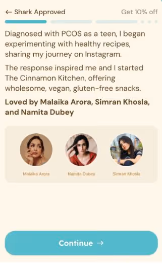
Storytelling popups take multistep-intent popups up a notch.
Not only is the customer now exchanging information for a coupon code, they are also getting educated about the brand you are building and the exact problem you’re solving.
But would a longer popup not cause many drop offs?
That’s what most founders think but we have data of 14+ of our own brands that are using this approach AND 2000+ other brands in the US using the same approach. In all cases, this new setup has increased the popup subscription % significantly, with the average being a 30% bump in customer data once a storyselling popup was implemented.
After having worked for 5+ years in new category creation, I am certain that this is the way forward in India as well, especially when it comes to high AOV-new-category brands that are solving big problems for new India. It also compliments our anti-elastic framework of growth pretty well.
How to implement this?
Just reach out to our friends at Alia - a software company that specialises in popups.
Tell them you’re referred by Porcellia and they will give you:
It is unfair to test a storyselling multi-step popup against a regular popup, because multi-step will ALWAYS win. But when comparing different kinds of multi-step intent popups, here are the things you can test out:
And many more.
When you use a good popup tool, the ability to AB test is in-built into that.
Another reason we use Alia is that in their fully managed plan, Alia will run these AB tests on our behalf and once they find a version of the popup which is outperforming the current popup, they will automatically implement it for us. Their “white glove” fully managed plans means that when you buy their software, you literally have the founder helping you with powerful AB tests and tech help.
No this is not sponsored by Alia - we just love their work and their energy and want as many brands as possible to experience what we achieved for our brands.
Summarising
This means that you need to price your products in a manner that you can give a 20-30% discount on your first order popup and still be profitable.
Reason: you will be able to get more data reducing the time taken between decisions and experiments.
It's recommended but not mandatory. Most our brands never give more than 10% off.
Shoutout to my friend & mentor, Jon Ivanko, founder of Formtoro and a men’s personal care brand based in the US. His SAAS company specialises in data collection and multi-step forms and everything I know about popups and how to strategically use them comes from him. Almost everything in this guide are his teachings and i’ve taken help from his blogs to explain many key points above.
-> if your AOV is greater than rs.3000
The higher your AOV, the more this will benefit you - simply because expensive products are sold through stories more than through discounts - and that’s exactly the kind of power this popup will give you.
-> if you’re building in a complex category that requires a lot of customer education
-> If you’re struggling to increase popup fill rates beyond 7-8%
Use this popup incrementality calculator to find how much more revenue you can make simply by changing or upgrading your popup.
Note: this does not include the incremental revenue you will make from your retention flows. This is only showing you how your popup will help you with new customer cac and new customer increment.
In a world optimized for speed and dopamine, meaning is the only thing that lasts.
Read the full storyIn a world optimized for speed and dopamine, meaning is the only thing that lasts.
Read the full story
Get your hands on the the stuff that actually compounds.
Positioning. Retention. Content. Community.

Welcome to Finsweet's accessible modal component for Webflow Libraries. This modal uses Webflow Interactions to open and close. It is accessible through custom attributes and custom JavaScript added in the embed block of the component. If you're interested in how this is built, check out the Attributes documentation page for this modal component.
See docs